Overview
Visible. is an app dedicated to connecting BIPOC individuals who are seeking mental health services with BIPOC therapists that they would feel most comfortable with.
It was developed over two weeks for an assignment for BrainStation’s UX Design diploma program in November 2020, in which we were tasked with understanding and improving patients’ experiences of a focused aspect healthcare services.
Role
Product Designer
Tools
Figma, Sketch, InVision
Problem Space
One of the biggest challenges of seeking mental health help is finding a therapist that you are able to connect with and feel comfortable enough with to open up to. However, with a lack of diversity among mental health professionals, BIPOC millennials are having an even harder time finding someone who they feel can understand their lived experiences and intersectional identities.
Design Challenge
How might we improve the process of connecting BIPOC individuals to BIPOC therapists in order to provide them with the most effective treatment according to their needs?
Research Insights
Looking deeper into the current BIPOC experience around mental health, I found that:
BIPOC populations are more likely to be exposed to social determinants that increase the likelihood of developing a mental illnesses
‣ As the psychiatric system is still Eurocentric in values, worldview, and practice, there are systemic challenges for BIPOC individuals seeking help.
‣ And mental illness affects young people of colour at similar rates as white young adults but are less likely to be diagnosed or seek mental health services.
Interview Insights
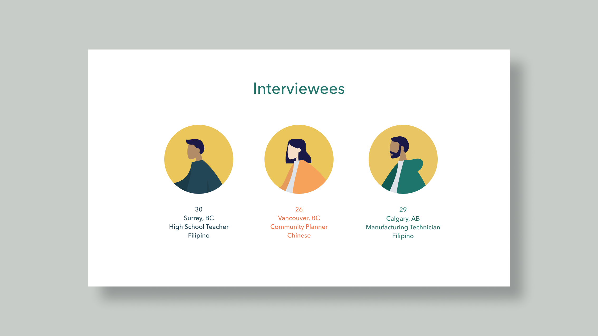
I conducted interviews with 3 BIPOC millennials to get first hand accounts of Canada’s mental health services and learned that a lot of the difficulty in seeking mental health services stem from a lack of accessible resources that directly points to what will meet an individual's particular needs (e.g. budget, availability, compatibility).
Being comfortable with the therapist greatly enhances the experience and effectiveness of the session. Having a common background between the therapist and the patient can establish that comfort more quickly.
Persona
With overlapping goals, motivations, behaviours, and pain points between my interview subjects, I was able to develop a persona:
Sketches
Drawing inspiration from the health services app Babylon, the mediation app Headspace, and from the web directory Healing in Colour, I began sketching out how my solution’s layouts and task flows.
Wireframes + User Testing
Using these sketches, I made initial wireframes and a lo-fi prototype, and from there, moved on to making a couple iterations of mid-fi prototypes. I did a round of user testing between each iteration, noting what went well and making changes that would improve the user experience.
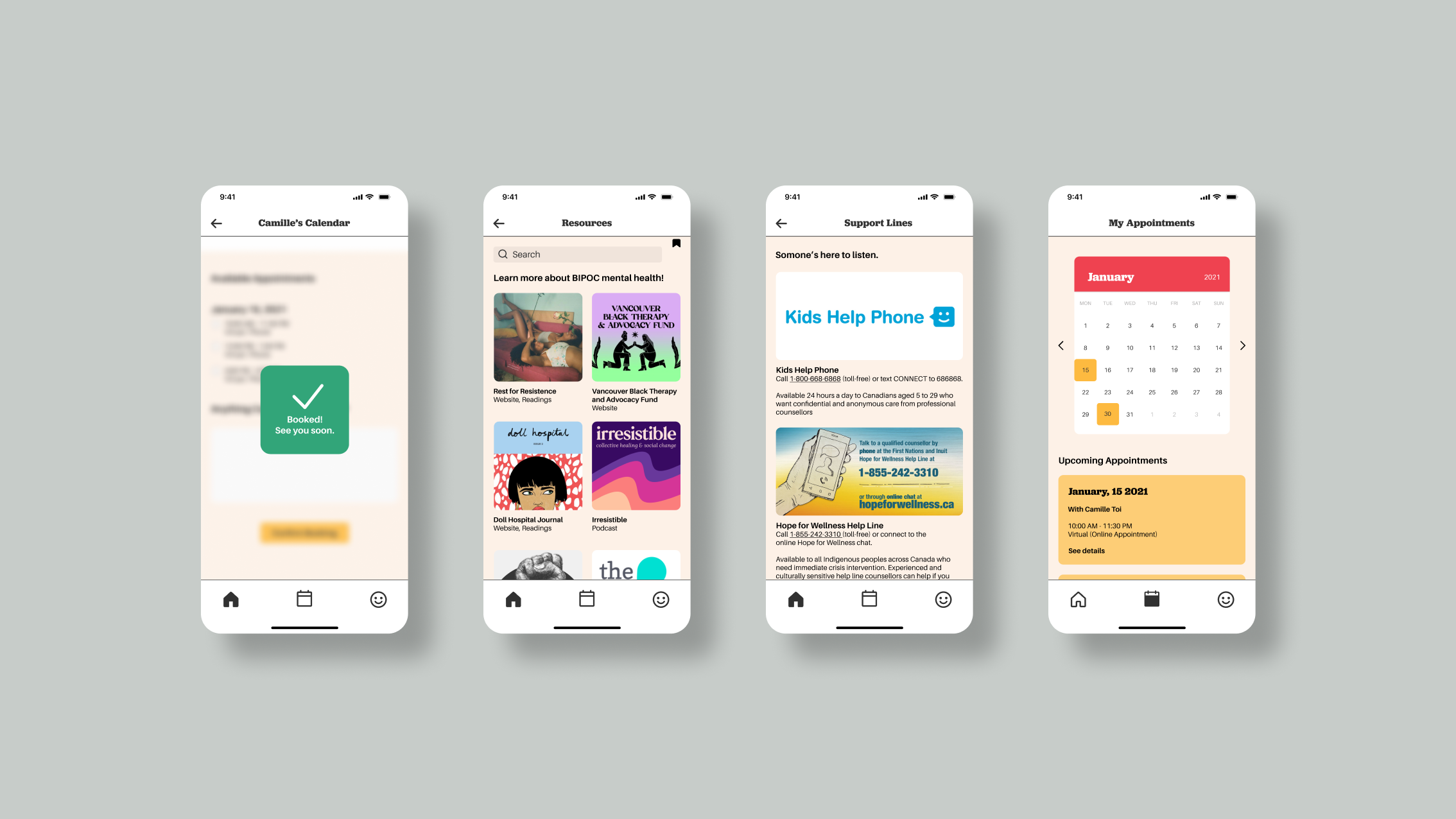
Hi-Fi + Prototype
With the final hi-fidelity prototype, I believed that the use of colour would be vital in conveying that the app is dedicated to people of colour. I also tried to create a sense of welcome and friendliness, using rounded corners and playful typefaces (Jubilat and Aileron) which were designed by BIPOC designers.


