Overview
Raincoast’s B2B website had been revamped to better visually showcase the company’s expanding range of distributed products and improve its overall browsing experience.
Between February and September 2021, I collaborated with the book distribution company’s CEO, the marketing and sales teams, retailers, and third party developers to modernize the site’s look, refine current features, and ideate new ones to enhance how the company’s products are bought and sold.
Role
Product Designer
Tools
Figma, Excel
Problem Space
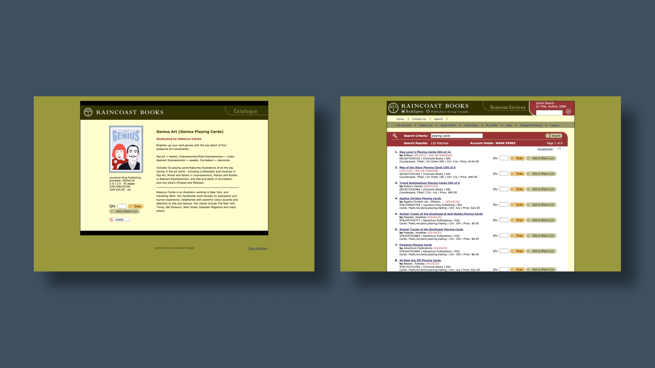
Raincoast’s previous B2B website had been developed quite some time ago and was designed with a focus on selling primarily books. It had been mainly used to list fiction and non-fiction titles, and other printed materials that didn’t require much visual representation beyond covers. There was also no other way to look through products aside from searching.
But as the publishing landscape shifts and client publishers broaden their product lines to include things such as stationery, puzzles, board games, homeware, and clothing accessories, it had become clear that the previous site did not provide a sufficient enough experience of visually browsing and discovering these items online.
Design Challenge
How might we redesign the B2B in order to accommodate our users’ growing need to better visually inspect the products they are interested and allow them to easily discover new ones?
New Features + Lo-Fi Wireframes
After years of use and recent discussions with the sales and marketing teams and with our business customers, what the previous site had been lacking became very apparent. The company CEO, who was also a systems engineer, and I used Excel to brainstorm and quickly draft some initial lo-fidelity wireframes and lay out proposed new features to improve the site:
Make the new site product photo-focused
Multiple angle or interior shots on product details pages
Curated collections or sales rep recommendations
Related products carousels to increase discoverability
Quick View with Add to Cart button
Favourites button + List
Site Map
I also drafted a site map to better project user journeys and task flows, understand each page’s relationship to another, and realize what new pages were needed.
Mid-Fi Wireframes + Prototype
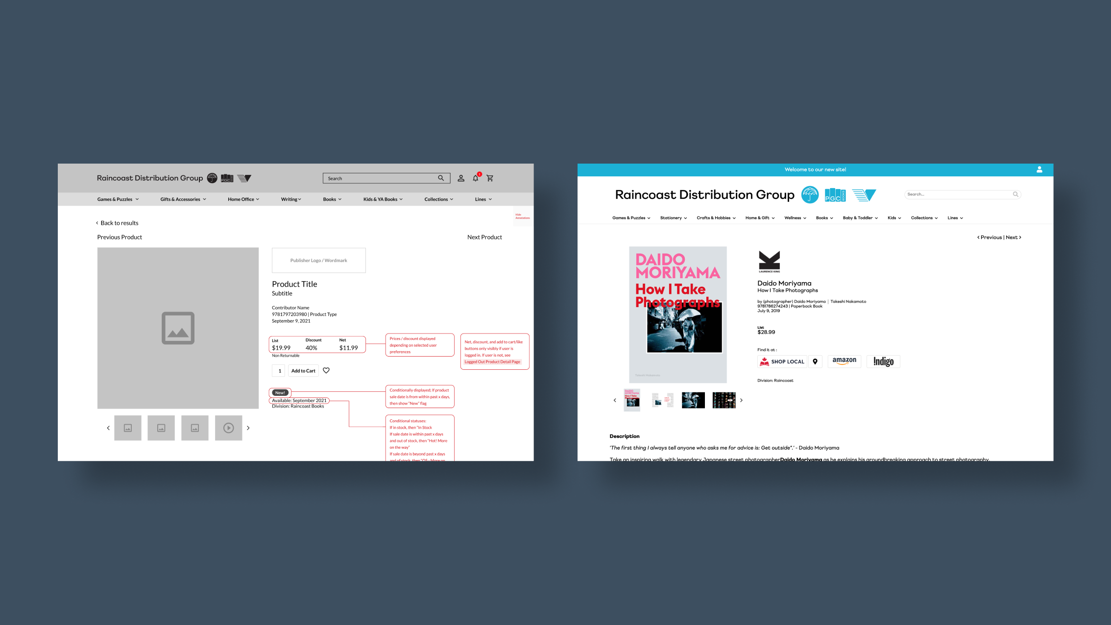
With a clearer direction of where we wanted to go, I designed a series of mid-fidelity wireframes, balancing between visual appeal and coherent information architecture. We wanted to emulate the layout of commercial book retailing websites to provide users with sufficient visual representation of products that need it while making browsing easy and intuitive enough to discover new products without the help of sales reps or catalogues. We also wanted to maintain the functionality that buyers using the B2B would expect.
I connected these wireframes in a robust prototype in order to test how navigating the site felt and evaluate how new features were implemented.
Development
To help with development, I provided asynchronous notes through annotations on the wireframes, describing conditional states of certain components or pages. And through frequent meetings to ensure our visions were aligned, we worked with developers, Bluebee, to bring the site to life.


